TruU Mobile App
Role: UX UI Designer / UX Researcher / Product Designer
Introduction
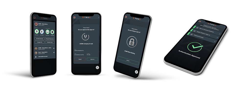
TruU is a multi-factor identity platform that provides unmatched security for both physical and digital resources. TruU uses a unique combination of phone-based biometrics and behavioral identity signals to flawlessly identify users.
For this project, I worked closely with our product engineering team to understand the complexities of our product. I took the role as lead UX and interaction designer to establish how users would experience the product in the physical world, as well as how they would interact with the mobile app.

Research
I interviewed the CEO and founder of TruU as well as several of the main stakeholders. Additionally, I surveyed our partners and customers who were beta testing the current product to better understand the scenarios in which they use the product and their expectations of experience and outcome.
I conducted competitive research with companies such as HYPR, Duo, and Double Secret Octopus. I compared our offerings with those of our competitors to identify holes in the market and where we can outshine our competitors.
Problem Statements
Companies need an impenetrable, multi-factor security solution that eliminates the need for passwords and seamlessly identifies users.
Users expect passwordless security to be a silent shield. Any interaction beyond what they are accustomed to is an inconvenience or a disruption.

User Mindset
To better understand our end-users we interviewed 25 people across 3 companies. We explored their working conditions, common distractions, interest in technology, and understanding of security.

Synthesis
Personas
Based on the patterns found in our user research, we created 3 personas that represent the key players to design for. These personas promote user-centered design and give our team a person to empathize with and design around.
The first represents our buyer. This is someone that is looking at our product to fill a need at their company. This is usually a chief security officer that needs to improve their current security service. Their primary motivation is to improve company security with minimal change to current infrastructure and they are limited to products that fall within their budget.
The second represents an influencer. This is someone that is a leader at the company. They may have a director title, manage a group of people, or be an individual that is seen as a leader among colleagues. They are motivated by the long-term benefits and they are willing to put the work into changing habits because the end goal is very clear.
The third represents the majority of our end-users. This person is the most difficult to please. They are focused on their roles and they experience amplified inconvenience when mundane procedures get in the way. They are impatient and easily frustrated when asked to change their habits around technology. When things do not work as expected they are quick to lose faith and never return.

Journey Mapping
Using our personas we created several journey maps to better understand the thoughts, feelings, and actions that our users experience when they interact with our product. For each use case, we established a scenario and user expectations. We then outlined the phases for each scenario and broke out each action required by the user and the emotions that commonly occurred during the actions.
These journey maps helped us identify points of frustrations, when issues were occurring, and the level of impact. This helped us Identify product pain points and areas of opportunity, as well as how to prioritize improving design, fixing bugs, and adding features.

Areas for opportunity
Design Requirements
-
Create a completely passwordless solution for enrolling with the product
-
Allow the user to authenticate their identity using their mobile phone
-
Ensure privacy and build trust with the user by explaining how the product works
-
Establish confidence that the product is functioning in an accurate and secure manner with notifications and in-app feedback
-
Provide a way for the user to create multiple profiles and enroll multiple devices
Pain Points:
-
Adding extra steps to access company resources are burdensome.
-
Users don’t understand how the product adds value to their workday.
-
Actions taken on the app do not provide accurate or timely feedback to the user.
-
Learning new procedure / changing habits is inconvenient
-
Onboarding is disorganized, causing the user to ping-pong between several different types of devices.
Information Architecture
Using the persona’s and the design requirements, I created several sketches to visualize how users will navigate the mobile application. Although the mobile app is a complex beast, it needs to operate silently and require minimal interaction from the user. Elements of high-tech automation should reduce the cognitive load on the user.

Ideation
As a team of designers, engineers, and product owners we carefully thought through the scenarios that would take place when our users interacted with our product. We broke down each movement. We dared to dream - and then we evaluated what was possible and what would require further investigation.

Storyboarding & Wireframes
We used storyboarding to visualize how the interaction would take place based on where users kept their phones. We observed the behaviors of those around us; carefully taking note of habits and conceptualizing how our product can fit into these scenes without causing a disruption.
Wireframes, based on the information architecture, enabled us to play through scenarios in real life so that we could better understand how our product would impact users in the real world.

Prototyping & Testing
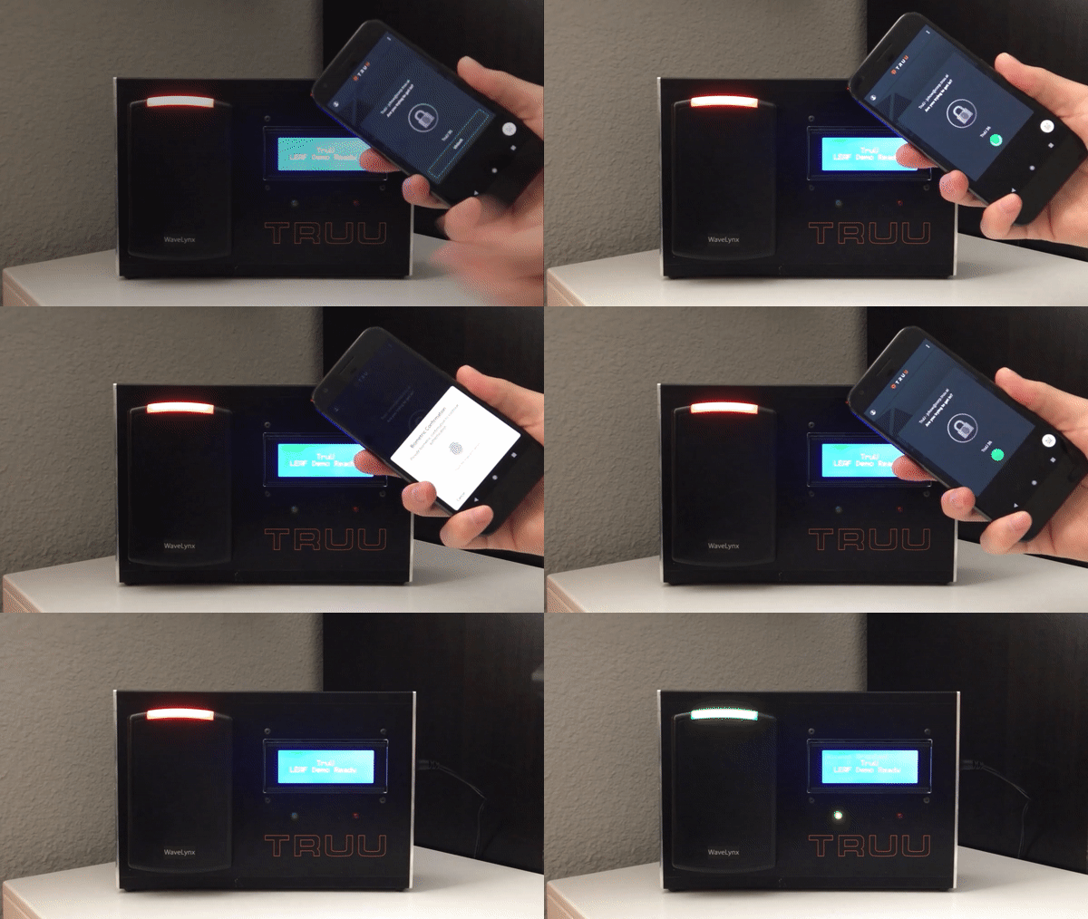
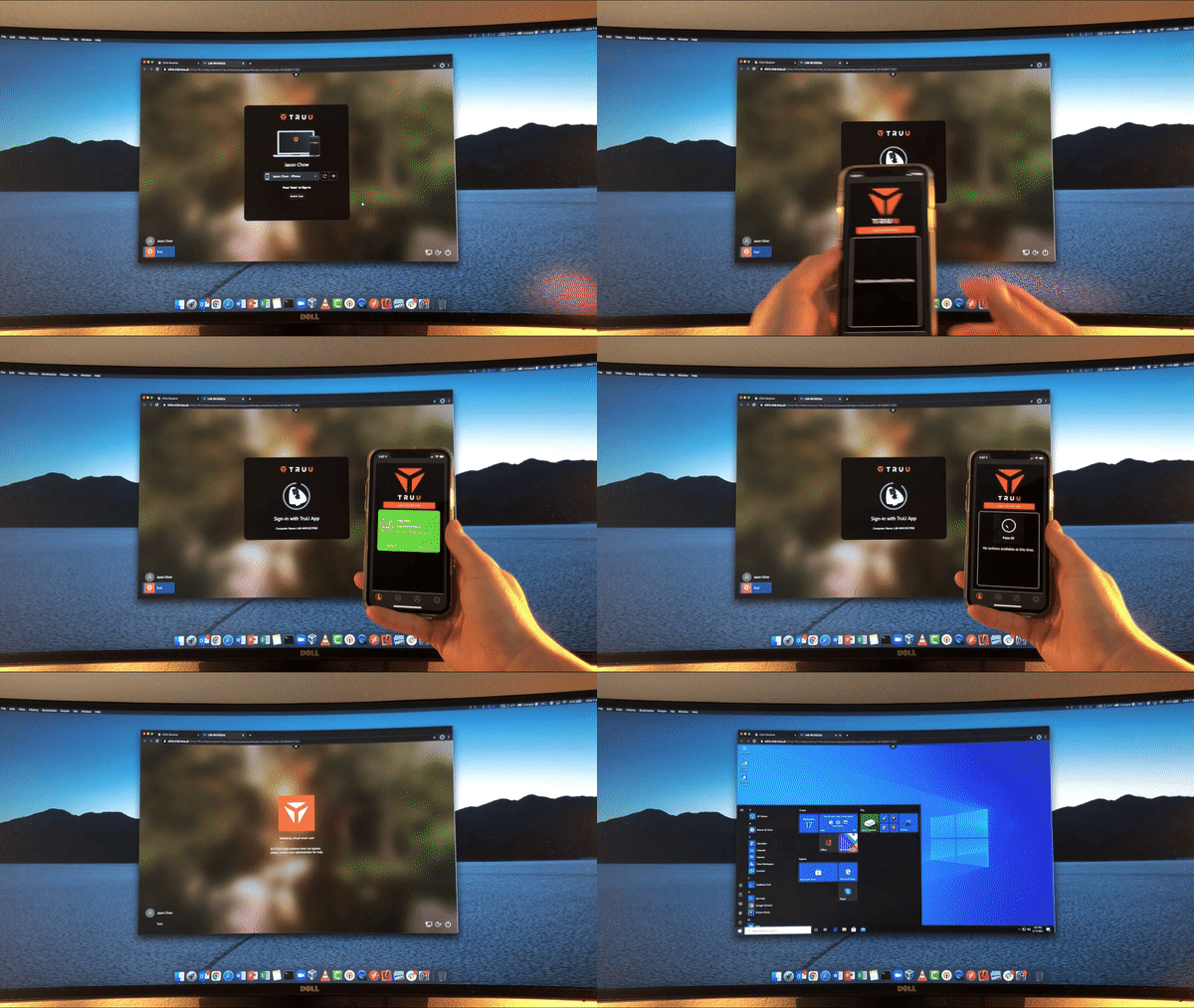
I created several prototypes that were guerilla tested amongst colleagues and friends. I used that feedback to create high fidelity mockups to test out product performance in the real world.
Further evaluation and feedback uncovered insight about how our users interact with locked doors, computers, and applications; exposing ergonomic gestures, interaction patterns, and underlying habits.
A/B Testing Final Design Options
To determine the final design and functionality, I used all of our assets to put together 2 design options that fit the needs of our users. We beta tested the 2 options with 2 groups of 15 volunteers. They used the mobile app to access physical and digital resources at their company for 2 weeks.
After 2 weeks, we conducted user interviews to understand what worked and what did not. Participants kept a diary of their experience and shared communications that occurred amongst the colleagues during the testing. After collecting this feedback, we were able to clearly understand the frustrations our user experienced and confidently pursue a design that met our users expectations.

Design
After several rounds of testing, I organized all of the data to come up with the final designs for the TruU mobile application. The tone exemplifies the advanced technology behind the product. The user interface is powerful, dramatic, and protected.
Human-Centered Design
-
Execution of actions should be easily incorporated into daily routine
-
Affordances allow for a range of acceptable interactions within constraints so that our product convenient to use for everyone
-
Signifiers help with discoverability by providing hints to instruct users
-
Ergonomic design enables efficient and comfortable use
-
Skeuomorphic design provides continuity between how our product works and experiences that exist in the real world


Reflections
As our mobile app is deployed to more and more users, we will continue to test and iterate. By the beginning of 2022 there will be 20,000 users of our product and we are excited to collect feedback.