TruU Desktop Agent
Role: UX UI Designer / UX Researcher / Interactions Designer
Background
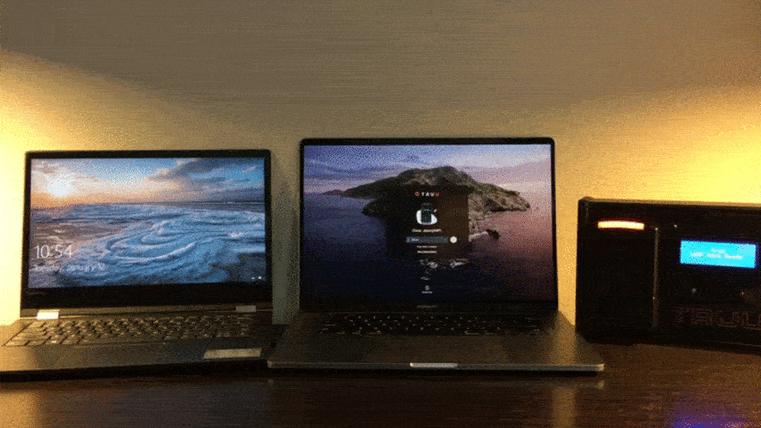
TruU Desktop Agent provides premium security and complete identity confidence for the Mac and Windows desktop. Our goal is to create a method of seamless, passwordless sign-in by connecting with the user’s TruU mobile app.
TruU’s multi-factor authentication technology confidently identifies and allows for desktop access when the user is within proximity of their computer.
From the ground up
Both front-end and back-end development were extremely complicated and required hacking the native Mac and Windows systems to create the desired security product. Following the original development, we began working directly with the developers at Apple and Microsoft to improve and better integrate our product.
Team
In a team of 6, my role was Senior Product Designer and UX Researcher. I led the design strategy and UI design for low-fidelity mockups, high-fidelity mockups, and final design. I worked alongside our VP of product, Lead Windows Engineer, Lead Mac Engineer, Lead Mobile Engineer, and Junior Designer.
Methods
Mapping: Personas, empathy mapping, journey mapping
Usability Research: Competitive analysis, user interviews, and UserZoom to test heuristics and organization of flows
Tools: Figma, Adobe XD, Adobe Ai, Google Surveys, UserZoom
Overview
Iterative evolution
When I signed on as the TruU UX Designer, the desktop agent existed as a prototype on one computer in the office. Saying the interaction was clunky would be a compliment. Nonetheless, the hack was an accomplishment that left out engineers grinning from ear to ear as the product team got to work.

As the Lead UX designer, I worked alongside the product manager to create a product road map that required the development team to explore new solutions to improve the behavior and usability of the product. We worked iteratively in an Agile work environment using the Lean UX method to ensure output of minimal marketable features based on continuous product evaluation.
Since bringing our product to market, we continue to improve the user experience and push the engineering boundaries with a/b testing, and immediate feedback from our users.
Evaluation
Insights came from partnerships with preliminary customers that agreed to act as test groups for our software. We performed usability testing, and UX interviews with over 30 product testers to gain valuable insight into where the product succeeded and where the product failed to meet the user’s needs.
With this information, I carefully crafted user personas to understand the roles and responsibilities of our users. As a team, we reference these personas to gain empathy and challenge our bias when brainstorming how to improve the product.


In combination with the journey map, we clearly defined product pain points and areas for opportunity. Through this exercise we found that our product was unreliable, confusing, and ultimately useless to the average user.

Pain Points (User):
-
The landing screens are not intuitive and the user does not know what to do. Feels hacky.
-
The interface is too text heavy. User’s feel the need to read all of the text and it takes a long time to read the instructions before being able to sign-in.
-
The product is unreliable and does not communicate issues.
-
Setup and pairing with the TruU mobile application is challenging. Unclear to initiate and too complicated to complete.
-
The language is very technical and hard to interpret for the average user.
-
The user doesn’t experience any feelings of increased security.
Benefit Hypothesis
Our goal was to improve enterprise (and personal) security for Windows and Mac computers. We will provide identity verification that far surpasses any other multi-factor authentication when it comes to passwordless sign-in.
Although the value of our product is unmatched security, we needed to match (or surpass) the frictionless user experience of the native Mac and Windows sign-in to be successful.
Collaborative Design
I assembled a diverse team to promote decentralized collaboration and decision making; including backend engineers, front end developers, and our product manager.
.jpg)
We started with a collaborative empathy exercise based on the personas, journey maps, and pain points. Together we evaluated technical limitations, security necessities, and brainstormed opportunities to enhance functionality, improve ease of use, and establish a branded personality to promote a trustworthy bond with the user.
Pain Points (Product Team):
-
Flows are overly complicated. The product gives the user too much manual control that provides no added benefit to experience.
-
There are too many customized screens to keep track of features and functionality.
-
The screens lack cohesion and brand personality. The product lacks an emotional relationship with the user.
-
Capabilities are limited and the development team needs time to explore the possibilities on the backend.
-
Pressure to release the product leads to urgent decision making and lack of communication between teams and individuals.
Achievable Solutions:
-
Focus on making our product intelligent; automate processes and remember preferences.
-
Curate the experience so that screens follow a centralized design pattern with consistent controls throughout the product.
-
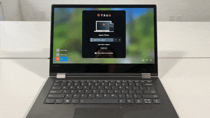
Pull in elements from the native sign-in screens. For example display username, or user thumbnail. Maintain familiar language as the native sign-in.
-
Engineering and design must compromise on features to release in a timely manner.
-
Encourage in depth sharing during daily stand ups and inclusivity in the decision making process throughout the day.
Minimum Marketable Features
Working on an Agile team means building incrementally. This allows us to reduce our time to market, make important updates quickly, and test our hypothesis.

Focus on simplicity and approachability
Our product required a great deal of technical literacy. We needed to move toward a design that was accessible for all levels of technical competency. To do so we reduced the number of decisions required by the user.
We reduced the number of flows to one main flow with intelligent fall backs. We kept only necessary control buttons to reduce confusion.

More intuitive UI to allow more improved UX
User’s struggled to use the original interface because it started as a plain text screen with limited formatting. Due to the challenges of manipulating the native sign-in screens for Windows and Mac we moved to a model UI. This allowed us full control of the UI so we were able to implement common elements like drop downs and buttons as well as customizing the look and feel of our product.

Establish the product as cutting edge technology
The sign-in process needed to be just as easy, if not easier, than username and password. Our product needed to be one step ahead of existing products, to fulfill the user’s needs before they could even ask for it.
We turned our attention to proximity unlock which only required that the user show some form of intent to sign-in while within bluetooth range of the computer.

More Informative Messaging: Create messages that help the user troubleshoot
We reduced the written content, sometimes removing it entirely. The action scenes with inputs should be intuitive to the point that no explanation be required. Error messaging should explain the issue in layman’s terms and provide simple troubleshooting solutions.

Usability Testing & Design Iterations
As our user base grows, we are able to obtain meaningful user feedback. As a team, we have compiled this data to create 3 personas that define our core users.
As we distill whom we design around, we are able to create journey maps that accurately outline the user experience so that we can evaluate product pain points and opportunities.
Pain points:
-
Enrollment is confusing; several enrollments happening at once between mobile and desktop - often leads to a dead end
-
The process is confusing, screens are cluttered, unnecessary interaction wastes times
-
The login process takes too much time and requires too many steps (few desktop agent screens, but several steps between devices add up)
-
Error screens are technical and do not provide an easy path forward for the end-user
-
Unexpected auto-lock prompts are frustrating
Opportunities:
-
Help the user get started with the product with an explanation of the product and how to use it
-
Speed up interactions by simplifying UI and flows (parity between Mac and Windows agents)
-
Provide intuitive path forward with organization of information and visual hierarchy
-
Allow flexibility and freedom with a back button and an emergency exit
-
Help users recover from errors by explaining in language that the user understands and providing constructive solutions
Summary
As a result of the team’s hard work we were able to improve the user experience and product performance exponentially. With each mile stone that we presented to our stakeholders received resounding applause as well as critical feedback. For instance, we learned that manipulating the native interface caused a disorienting feeling for the user and moving towards a model interface was a necessary threshold to build user behaviors and habits unique to desktop integration.
In the first quarter of 2021 we will deploy our desktop agent to over 150 users, increasing to 2,000 users by the end of Q2. With plans for additional contracts, we are excited to grow our user base so we can learn more about the experience and adapt our product.